The Market Bacchanal Rages On — While I Remain Celibate (Part 2)
This is Part 2 of of a multi-part discussion of the market (read Part 1 here)…
The Equity Risk Premium Is Now at a Discount and the Shiller CAPE Ratio Is Near an All Time High
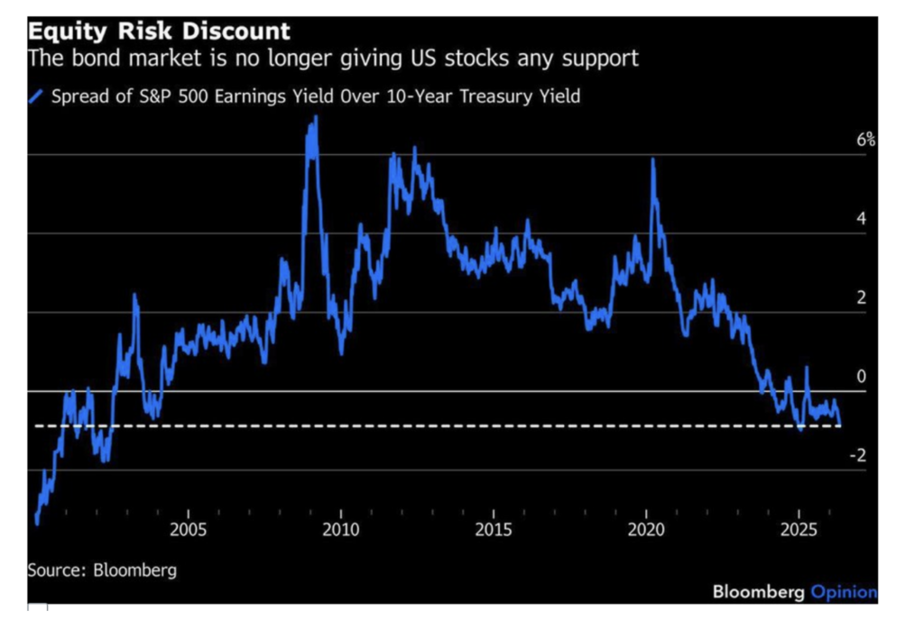
The chart below, of the equity risk premium, is probably the most important reason for my ursine market view.
The equity risk premium is the difference between the S&P earnings yield (the inverse of the P/E ratio) and the risk-free rate of return.
Surprisingly, the equity risk premium has morphed into an equity risk discount — standing at the deepest discount since 2003. As of Tuesday, the S&P Index’s earnings yield was 90 basis points lower than the risk-free rate of return (using the 10-year yield) — meaning that market participants believe there is more risk in holding bonds than in holding equities!
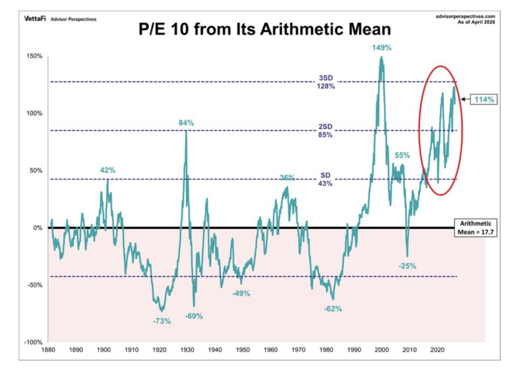
Here is another chart that has concerned us — the P/E 10 ratio. This ratio measures stock prices against the average of 10 years of inflation-adjusted earnings to smooth out short-term business cycle distortions. Thursday’s reading of 37.9 is +114% above its long-run arithmetic mean, placing into a zone only visited once before in the last 150 years — during the dot-com bubble (when it stood at 44.2). Today’s P/E 10 reading is above the level hit in 1929:
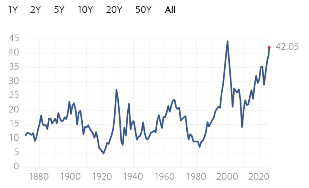
The P/E 10 chart above is a derivative of the Shiller CAPE Ratio shown below (which I have presented to you often over the last 24 months). Shiller CAPE now stands at 42.05, a whisker away from the dot-com bubble high of 44.0.
It would take a 60% fall in stocks to reach the historical mean of 17:
Over the last century, every time the equity risk premium narrows considerably (as it currently has (in the extreme) transitioned into an equity risk discount) and the P/E 10 ratio moves as far as it is today from its arithmetic mean — a large decline and mean reversion in investment returns occur.
Stay tuned for Part 3…